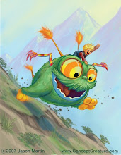
I liked the initial IDEA, but made tons of notes on this original doodle, knowing where it needed to be improved upon:

Beyond that, I knew there were fatal flaws in the entire composition. The color wasn't vivacious enough, the monsters looked like lame lions, instead of something that had more emotional impact (was trying to make an organic version of the Chinese lion statues we've all seen).
Finally, many years later, I came across Wukong, and he and the entire League of Legends universe, and it seemed to answer all the questions I had with the composition--this badass monkey HAS a staff, and is a natural character and animal to be so deftly balancing on it! The minions and realms where you fight in League of Legends had the natural type of surroundings that'd add more drama to my composition. And Cho'Gath is just a more vicious-looking champion and frustrates enough LoL players that'd be thrilled to see him wasted on the ground.
From there, I had some great friends that really helped me evolve this initial idea to the next level. I love that I have seriously talented friends in the industry that are willing to give me honest and constructive feedback. You can't ignore a note if you hear it consistently from completely different sources. Or, as I like to say, "If nine Russians tell you you're drunk, lie down." Here's more of the process I went through:

The Work-In-Progress
Value Study, with emphasis on Character, and general layout.
I already had a general idea from my prior illustration years ago of how it would look, so just wanted to make sure I could make Wukong look cool, and that it'd fit the composition layout.Refining Composition
After Wukong was heading in the right direction, I started to make sure that the rest of the elements tie together in the composition. I ended up flipping the mountains in the background as I was refining the background. It just seemed to "flow" better, from a composition standpoint.First Color Pass
Color isn't my strong suit, so I threw some color layers on the different elements, playing with the transparency layers and values of different background and foreground objects. Had very specific objects on different layers: Wukong had two color layers, Minions had one, trees had a color layer, the entire background did, and Cho'Gath was broken into several pieces (head/arms, torso, leg, abdomen) which ended up helping me greatly, as things were further refined.Revisions Based Off My Friends (aka, "No Man Is An Island")
I *highly* recommend to all artists out there to get feedback often and frequently during a composition. To create entirely in a vacuum is just not beneficial to the end result of your product. At this point, I got feedback from some good and trusted friends. Got consistent feedback from all: they had a hard time understanding the foreshortened shape of Cho'Gath (LoL players knew exactly who the character was, but I need to think beyond a niche audience, and make sure shapes read properly, especially since you may be involved in creating promotional art of characters to draw new players in); even more specifically, the left leg/knee cap was described as "penis rock" by several of my friends. You gotta eat a big piece of humble pie if any drawing you make gets phalic references from your buds! There was also requests to cool down the background to make the character "pop" more, and perhaps blur the background for more drama.Responding To Feedback
Ended up redrawing the penis leg, and that actually helped with the entire composition's perspective, and clarified the features of Cho'Gath, as well. Since the color was on a different layer, and the body parts were separated on layers, it wasn't nearly as complicated a revision as it could've been. Cooled down the background, too. Dammit, they were right, it helped! They also noticed that the sky streaks should be going from right-to-left, just to add more flow to the composition.Fine-Tuning
If time permits, I highly recommend walking away from a composition and returning a few days later. Don't think about it, don't picture it in your mind. Come back to it fresh, and see if anything else "pops" at you. I did that, and decided okay, the background would look pretty cool blurred. Like my friend suggested. Did a slight blur to the front claw, as well, to add a real shallow depth-of-field. Also polished up some features on the ground, on the minions, and on Cho'Gath and Wukong's weapon and costume.So I hope you enjoy my rendition of the champion, and please vote on which League of Legend character I should draw next!


No comments:
Post a Comment